

前言
近日,笔者抛弃了原来的WordPress博客,转投Halo后,选择了Icarus作为博客主题,选择此主题的原因则是因为被其简约而养眼的设计所吸引了,但也许是主题年代久远的原因(最后一次更新于2020年3月25日),下载安装过后,设置页面较为简陋。同时,也存在许多值得优化的空间(如标题过长时在移动端访问页面会被拉伸、代码无行号显示、无法自定义背景、加载js文件缓慢等)。虽然无法通过设置修改,但Halo后台仍然提供了主题编辑功能,因此,笔者花了大约1天时间,针对上述问题,将该主题进行了一些优化。
显示优化
站点背景图
白花花的背景确实显得有些单调,在此,笔者提供一种添加网站自定义背景的方式:
在主题编辑中,找到文件/layout/layout.ftl,在其中的<body>标签下添加三行HTML代码:
<div class="background-cover"></div>
<div class="background-img"></div>
<div class="background-cover2"></div>
接着,在上方添加CSS样式:
    <style>
		.background-cover2 {
			content: "";
			position: fixed;
			top: 0;
			left: 0;
			width: 100vw;
			height: 100vh;
			background-color: rgba(255,255,255,0.7);
			z-index: 0;
		}
		.background-img {
			top: -1vh;
			left: -1vw;
			width: 102vw;
			height: 102vh;
			position: fixed;
			background-size: cover;
			background-image: url(/upload/2022/03/bg-c5bdb3156ccc418499ebb6ebe51a63bf.png);
			backdrop-filter: blur(5px);
			filter: blur(5px);
			z-index: 0;
		}
		.background-cover {
			top: -1vh;
			left: -1vw;
			width: 102vw;
			height: 102vh;
			position: fixed;
			background-size: cover;
			filter: none !important;
			backdrop-filter: none !important;
			background-image: url(/upload/2022/03/bg-c5bdb3156ccc418499ebb6ebe51a63bf.png);
			z-index: 0;
		}
		.show-two-lines {
		  overflow: hidden;
		  text-overflow: ellipsis;
		  display: -webkit-box;
		  -webkit-line-clamp: 2;
		  -webkit-box-orient: vertical;
		}
		.footer {
			background-color: #fafafa !important;
			background: #fafafa !important;
		}
    </style>
其中,background-image即为替换背景图片的地址,此处背景图片有模糊效果,为了遮盖边缘模糊造成的白边,在模糊背景后添加了一层为模糊处理的背景层,并在模糊背景前添加了一层白色遮罩,使得视觉上更加美观。

文章添加评论数量、阅读量信息
分析主题代码可知,显示文章组件的文件位于/layout/common/article.ftl,该文件中,包含两种情况的组件渲染:未点开文章时(即在文章列表页面)和阅读文章时,此处针对两种情况分别进行修改。根据Halo官方文档可知,阅读量和评论量参数均在post对象中给出,其变量名分别为visits和commentCount,此处只需简单加上即可。
未点开文章时
找到用于判断当前页面状态的if语句:
<#if index && post.summary?? && post.summary!=''>
并修改其中的代码
        <#if index && post.summary?? && post.summary!=''>
		<style>
			.post-info {
				-webkit-font-smoothing: antialiased;
				text-rendering: optimizeLegibility;
				text-size-adjust: 100%;
				font-family: Ubuntu,Roboto,"Open Sans","Microsoft YaHei",sans-serif;
				text-align: left;
				color: #4a4a4a;
				font-size: .75rem;
				white-space: nowrap;
				margin-left: 10px;
			}
		</style>
        <div class="level is-mobile">
            <div class="level-start">
                <div class="level-item">
					<a class="button is-size-7 is-light" href="${post.fullPath!}#more">让我康康</a>
					<span class="post-info">
					  ${post.visits} 阅读
					</span>
					<span class="post-info">
					  ${post.commentCount} 评论
					</span>
				</div>
            </div>
        </div>
        </#if>
点开文章时
找到用于判断当前页面状态的if语句:
<#if index>
注意,此处是判断是否包含index参数,即判断是否为文章列表,因此,代码应在else代码块中修改
修改后的代码如下:
<#else>
<#if categories?? && categories?size gt 0>
<div class="level-item">
<#list categories as category>
<a class="has-link-grey -link" href="${category.fullPath!}">${category.name!}</a>
</#list>
</div>
<div class="level-item has-text-grey">
${post.visits!} 阅读
</div>
<div class="level-item has-text-grey">
${post.commentCount!} 评论
</div>
</#if>

代码增加行号、点击复制功能
找到/layout/common/scripts.ftl,在其中增加如下代码段即可:
<#if is_post?? || is_sheet??>
<script src="//cdn.bootcss.com/highlight.js/9.11.0/highlight.min.js"></script>
<script src="//cdn.bootcss.com/highlightjs-line-numbers.js/1.1.0/highlightjs-line-numbers.min.js"></script>
<script src="/upload/2022/03/highlightjs-copy-button.min-0530aa7bccca423fad82969114b188bd.js"></script>
<script>
  hljs.initHighlightingOnLoad();
  hljs.initLineNumbersOnLoad();
  hljs.initCopyButtonOnLoad();
</script>
</#if>
其中,is_post和is_sheet用于判断当前页面是否为文章页和自定义页面(is_post和is_sheet为官方定义的全局变量),代码段仅在以上两种情况中会用到,可以按需引入。
在引入后,访问含有代码块的页面,会发现显示效果仍然不太好,例如行号与代码过于紧凑、鼠标移至行号处会在右上角弹出第二个copy按钮、HTML代码会导致行号错位,此时,需要在/layout/layout.ftl处插入一段简单的CSS作为polyfill即可:
    <#if is_post?? || is_sheet??>
        <style>
			.hljs-line-numbers {
				pointer-events: none !important;
				margin-right: 0.5em;
			}
            .token.tag{
              height: 1em !important;
            }
        </style>
    </#if>
文章阅读前添加字数提示信息
此处为锦上添花的功能,实现起来一样较为简单。根据查阅资料,可知大多数情况下,平均阅读速度在400~600字/分钟,根据本博客文章内容复杂度考虑,笔者取速度为500字/分钟,则实际耗时=文章字数/阅读速度。
因此,只需在/layout/common/article.ftl中插入如下代码,即可实现:
		<#if !index>
		<style>
			.read-tips {
			    -webkit-font-smoothing: antialiased;
			    text-rendering: optimizeLegibility;
			    text-size-adjust: 100%;
			    font-weight: 400;
			    line-height: 1.5;
			    font-family: Ubuntu,Roboto,"Open Sans","Microsoft YaHei",sans-serif;
			    color: #4a4a4a;
			    font-size: 1rem;
				box-sizing: inherit;
			    margin: 0;
			    background-color: rgb(236, 245, 255);
			    border-left: 5px solid rgb(217, 236, 255);
			    padding: 1.25em 1.5em;
			    margin-bottom: 1em;
			}
		</style>
		<div class="read-tips">
			<b style="color: #409EFF; font-size: 1.1rem;">阅读提示</b>
			<p style="color: #4a4a4a;">本文共${post.wordCount}字,阅读大约需${(post.wordCount/500)?int}分钟。</p>
		</div>
		</#if>
注:此处配色参照element-ui

文本过长显示问题修复
文本过长的问题在该主题中多处都有体现,例如友链处的链接溢出;最新文章、最新评论过长影响显示效果;文章末尾上下篇文章导航处,笔者针对上述三个场景进行了细节优化。
虽然分为3个场景,解决方法却基本一致——即减少显示长度呗()
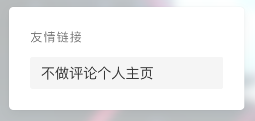
友链处链接溢出解决
使用最简单粗暴的方式(把溢出的链接部分移除)即可,打开/layout/common/widget.ftl,替换友链组件代码:
<#if settings.sidebar_links!true>
            <@linkTag method="list">
            <#if links?? && links?size gt 0>
                <div class="card widget">
                    <div class="card-content">
                        <div class="menu">
                        <h3 class="menu-label">
                            友情链接
                        </h3>
                        <ul class="menu-list">
                            <#list links as link>
                                <li>
                                    <a class="level is-mobile" href="${link.url!}" target="_blank">
                                        <span class="level-left">
                                            <span class="level-item">${link.name}</span>
                                        </span>
                                    </a>
                                </li>
                            </#list>
                        </ul>
                        </div>
                    </div>
                </div>
            </#if>
        </@linkTag>
      </#if>
最新文章、最新评论显示过多行
只需限制显示行数即可,同样十分简单,打开/layout/layout.ftl,添加以下样式:
.show-two-lines {
  overflow: hidden;
  text-overflow: ellipsis;
  display: -webkit-box;
  -webkit-line-clamp: 2;
  -webkit-box-orient: vertical;
}
接着,在相应的组件中添加该class名称即可:
/layout/widget/recent_comments.ftl
<div class="card widget">
    <div class="card-content">
        <h3 class="menu-label">
            最新评论
        </h3>
        <@commentTag method="latest" top="5">
            <#if comments?? && comments.getTotalElements() gt 0>
                 <#list comments.content as comment>
                    <article class="media">
                        <div class="media-content">
                            <div class="content">
                                <div><time class="has-text-grey is-size-7 is-uppercase" datetime="${comment.createTime!}">${comment.createTime?string('yyyy-MM-dd')}</time></div>
                                ${comment.author!} : <a href="${comment.post.fullPath!}#comment-wrapper" class="title has-link-black-ter is-size-6 has-text-weight-normal show-two-lines">${comment.content!}</a>
                            </div>
                        </div>
                    </article>
                </#list>
            </#if>
        </@commentTag>
    </div>
</div>
/layout/widget/recent_posts.ftl
<div class="card widget">
    <div class="card-content">
        <h3 class="menu-label">
            最新文章
        </h3>
        <@postTag method="latest" top="5">
            <#list posts as post>
                <article class="media">
                    <#if post.thumbnail?? && post.thumbnail!=''>
                        <a href="${post.fullPath!}" class="media-left">
                            <p class="image is-64x64">
                                <img class="thumbnail" src="${post.thumbnail!}" alt="${post.title!}">
                            </p>
                        </a>
                    </#if>
                    <div class="media-content">
                        <div class="content">
                            <div><time class="has-text-grey is-size-7 is-uppercase" datetime="${post.createTime!}">${post.createTime?string('yyyy-MM-dd')}</time></div>
                            <a href="${post.fullPath!}" class="title has-link-black-ter is-size-6 has-text-weight-normal show-two-lines">${post.title!}</a>
                        </div>
                    </div>
                </article>
            </#list>
        </@postTag>
    </div>
</div>

文章导航(前一篇、后一篇)显示溢出修复
在/layout/common/article.ftl文件中,找到并替换以下代码:
<#if !index && (nextPost?? || prevPost??)>
    <style>
      .post-title {
        overflow: hidden;
        text-overflow: ellipsis;
        white-space: nowrap;
        min-width: 0;
        max-width: 80vw;
      }
      .post-nav-card {
        margin-top: 20px;
      }
    </style>
    <div class="card card-transparent post-nav-card">
        <div class="level post-navigation is-flex-wrap is-mobile">
            <#if prevPost??>
            <div class="level-start">
                <a class="level level-item has-link-grey article-nav-prev" href="${prevPost.fullPath!}">
                    <i class="level-item fas fa-chevron-left"></i>
                    <div class="level-item">
                      <div class="post-title">${prevPost.title!}</div>
                    </div>
                </a>
            </div>
            </#if>
            <#if nextPost??>
            <div class="level-end">
                <a class="level level-item has-link-grey article-nav-next" href="${nextPost.fullPath!}">
                    <div class="level-item post-title">
                      <div class="post-title">${nextPost.title!}</div>
                    </div>
                    <i class="level-item fas fa-chevron-right"></i>
                </a>
            </div>
            </#if>
        </div>
    </div>
</#if>
值得注意的是,若直接对<a>标签下级的<div>进行修改,由于flex显示特性,修改后将无法显示省略号,而是被直接截断。因此,需要在内部嵌套一层<div>。
使导航栏支持二级导航
导航栏若不支持二级导航,将会是一件较为头疼的事。很幸运的是,这被笔者所碰上了。那没办法,只能硬着头皮解决它。打开/layout/common/navbar.ftl,找到头部导航,替换如下代码:
            <@menuTag method="tree">
                <#if menus?? && menus?size gt 0>
                    <style>
                    /* sub-navbar */
.navbar-start li:hover .sub-menu,.sub-menu:hover{opacity:1;visibility:visible}@media screen and (max-width:1024px){.sub-menu{margin-top:4.25rem !important}}.sub-menu{line-height:1.5;font-size:.8rem;text-rendering:optimizeLegibility;font-family:"Source Serif Pro","Noto Serif SC",-apple-system,"SF UI Text","PingFang SC","Microsoft YaHei","WenQuanYi Micro Hei",sans-serif;font-weight:400;color:#5755d9;box-sizing:inherit;overflow-wrap:break-word;margin:0;border-radius:.1rem;list-style:none;transition:all .35s;position:absolute;z-index:1000;top:3.5rem;opacity:0;visibility:hidden;min-width:10rem;padding:.5rem 1rem;box-shadow:0 .067em 1.2em rgba(0,0,0,.14);background-color:#fff}.navbar-subitem{overflow-wrap:break-word;color:#4a4a4a;position:relative;flex-grow:0;flex-shrink:0;cursor:pointer;display:flex;align-items:center;text-align:center;padding:0.5rem 0.5rem}.navbar-subitem:hover{color:#3273dc;background-color:#fafafa}
                    </style>
                    <ul class="navbar-start">
                        <#list menus?sort_by('priority') as menu>
                        <li>
                            <a class="navbar-item" href="${menu.url}" target="${menu.target!}">${menu.name}</a>
                            <#if menu.children?? && menu.children?size gt 0>
                			<ul class="sub-menu">
                    			<#list menu.children?sort_by('priority') as child>
                				<li>
                					<a href="${child.url!}" target="${child.target!}" class="navbar-subitem">${child.name}</a>
                				</li>
                    			</#list>
                			</ul>
                  			</#if>
                        </li>
                        </#list>
                    </ul>
                </#if>
            </@menuTag>
此处由于css过长,已将其压缩为一行。值得注意的是,在窄屏情况下,导航栏会出现下移的情况,需要对其专门适配。

其他一些琐碎的显示优化
隐藏关注按钮
在/layout/widget/prifile.ftl文件中,找到如下代码,将其注释即可:
<div class="level">
       <a class="level-item button is-link is-rounded" href="${settings.profile_follow_url!'${blog_url!}'}" target="_blank">关注我</a>
</div>
修改阅读文章文案
在/layout/common/article.ftl中修改相应显示更多按钮的文案即可。
友链部分增加提示卡片
在/links.ftl中,替换代码:
<#include "layout/layout.ftl">
<#include "layout/common/article.ftl">
<@layout title="链接 - ${blog_title!}" canonical="${links_url!}">
    <#include "layout/widget/links.ftl">
    <style>
      .tips_card{
        margin-top: 15px;
      }
      .card-content>.menu{
        -webkit-font-smoothing: antialiased;
        text-rendering: optimizeLegibility;
        text-size-adjust: 100%;
        line-height: 1.5;
        font-family: Ubuntu,Roboto,"Open Sans","Microsoft YaHei",sans-serif;
        box-sizing: inherit;
        margin: 0;
        padding: 0;
        font-weight: 400;
        color: #7a7a7a;
        font-size: .75em;
        letter-spacing: .1em;
        margin-bottom: 1em;
      }
      .card-content>.link_add_help{
		-webkit-font-smoothing: antialiased;
		text-rendering: optimizeLegibility;
		text-size-adjust: 100%;
		font-family: Ubuntu,Roboto,"Open Sans","Microsoft YaHei",sans-serif;
		font-size: .75em;
		letter-spacing: .1em;
		list-style: none;
		line-height: 1.25;
		color: #4a4a4a;
		box-sizing: inherit;
		font-style: inherit;
		font-weight: inherit;
		align-items: center;
		display: flex;
		flex-basis: auto;
		flex-shrink: 0;
		justify-content: center;
		flex-grow: 1;
		padding: 10px;
      }
    </style>
    <div class="card widget tips_card">
      <div class="card-content">
        <div class="menu">
          添加友链
        </div>
        <div class="link_add_help">
          欢迎发邮件或以其他一切联系方式联系我添加友链,注意联系时提供站点名称和站点地址哦~
        </div>
      </div>
    </div>
</@layout>
页脚隐藏logo、添加备案信息等
在/layout/common/footer.ftl中,替换如下代码即可:
<footer class="footer">
<div class="container">
<div class="level">
<div class="level-start has-text-centered-mobile">
<!--
<a class="footer-logo is-block has-mb-6" href="${blog_url!}">
<#if blog_logo?? && blog_logo!=''>
<img src="${blog_logo!}" alt="${blog_title!}" height="28">
<#else>
${blog_title!}
</#if>
</a>
-->
<p class="is-size-7">
© ${.now?string('yyyy')} ${user.nickname!}
Powered by <a href="https://halo.run/" target="_blank">Halo</a>
<br />
Theme made by <a
href="https://github.com/halo-dev/halo-theme-icarus" target="_blank">Icarus</a>, customized by <a href="https://vvbbnn00.cn/" target="_blank">vvbbnn00</a>
<br />
<a target="_blank" rel="noopener" href="http://beian.miit.gov.cn/">沪ICP备2021021821号-1</a>
<a target="_blank" href="http://www.beian.gov.cn/portal/registerSystemInfo?recordcode=31011202013723" style="display:inline-block;text-decoration:none;height:20px;line-height:20px;">
沪公网安备 31011202013723号
</a>
<br />
<a href="https://icp.gov.moe/?keyword=20229961" target="_blank">萌ICP备20229961号</a>
<br />
<@global.footer />
</p>
</div>
<div class="level-end">
<div class="field has-addons is-flex-center-mobile has-mt-5-mobile is-flex-wrap is-flex-middle">
${settings.links_footer!}
</div>
</div>
</div>
</div>
</footer>
注:请尊重原主题作者的劳动成果,保留作者信息哦~
网站访问速度优化
根据笔者分析后,发现加载速度过慢的部分为从jsdelivr引入的js文件,针对该问题,可以更换CDN源或自建CDN。
此处笔者使用了一下钞能力,简单建立了一个jsdelivr的镜像CDN加速站点。作者使用的是腾讯云CDN,相应配置截图如下:

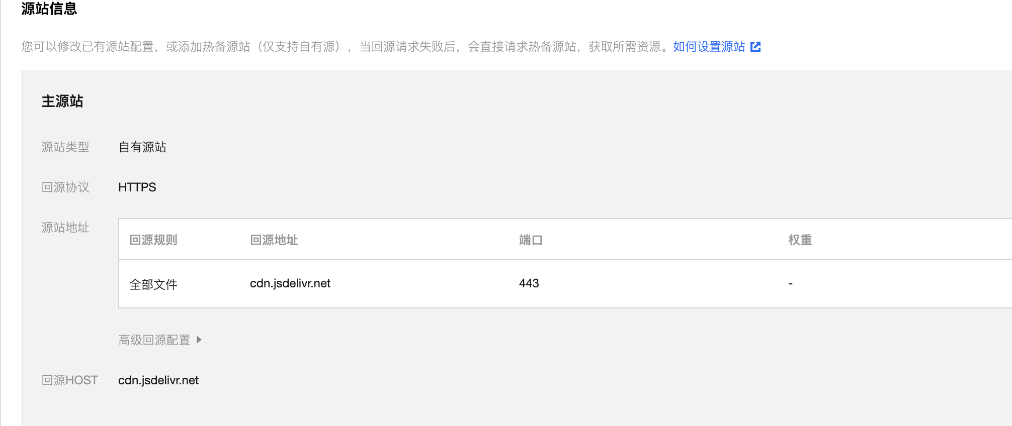
值得注意的是,在回源设置时,务必将端口号指定为443,而非80,因为80端口会重定向,这便失去了建立CDN的意义。
同时,为了防止被白嫖(主要是钞能力不够强大),笔者也设置了防盗链:
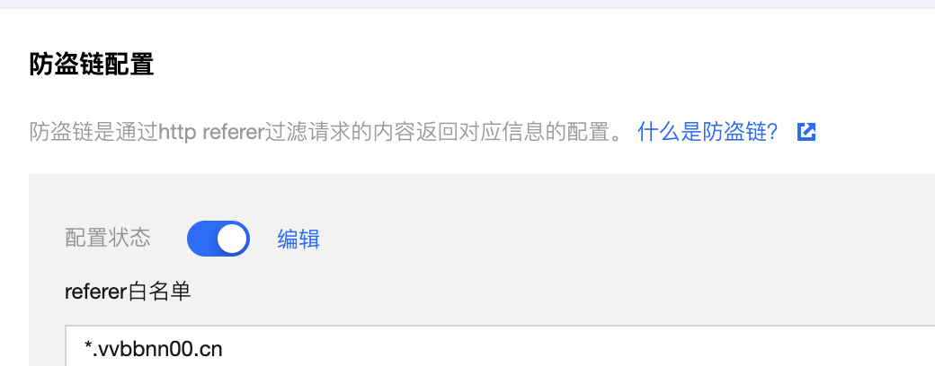
通过上图设置,可以限制只有自己的站点能访问该CDN。
最后,在配置完毕CDN节点后,别忘了将主题文件中,引用jsdelivr的js文件替换为自建的CDN节点哦~
尾声
至此,博客优化告一段落。当然,仍然存在不少可以改进的地方:例如文章阅读时的目录导航等。但奈何笔者技术力不足(悲),当然也有懒得成分,这些想法被推迟到了后续优化。也欢迎有同样想法的小伙伴一同交流~
PS:这次选了一个比较生草的封面